1.2.1. Header

Figure 1: Header of the Preview window
The Type Selector buttons are identical to those of the Sequencer header. The menu bar is limited to a stripped-down View menu. The Show Overlay button gets the company of the Display buttons (far right) and the Pivot Point in the middle. For more general info about the Type Selectors, see Sequencer header
1.2.1.1. View Menu
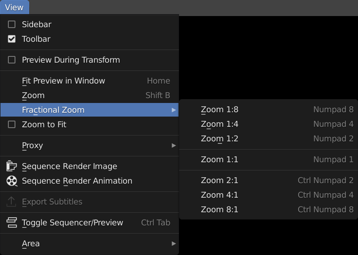
Figure 2: View menu of the Preview window
- Sidebar - Toolbar
See Sequencer header for more info.
- Preview During Transform
With this option disabled, dragging the left or right strip handle will extend or reduce the strip length but the current frame in the preview does not change. In other words, the image in the preview does not change during dragging. With the option enabled however, dragging the strip handles will show the frame the strip handle is pointing to in the Preview window. The current frame is temporarily disabled. This will allow very precise trimming.
- Fit Preview in Window Home
Resize the Preview window so that the Project Dimensions area it fits in. Depending on the specific rendered image, the height or the width or both are set equal to the project height or width.
- Zoom Shift-B
Click and drag to draw a rectangle and zoom to this rectangle. The selected area is centered in the window and the Preview is zoomed with a factor size preview window/ size selected rectangle. This is normally a zoom in, but you can also drag a rectangle selection that is larger than the Preview window (by starting outside the window; resulting in a zoom out.
- Fractional Zoom
Resize the preview (project area) in steps from 1:8 to 8:1 (see figure 1). Suppose that the Project Dimensions are: 640 x 640. A fractional zoom of 1:1 (Numpad - 1) will resize the project area (see Figure 1: Preview Areas so that it will cover exactly 640 x 640 pixels in the preview window. If the Preview window is very small, the image will extend beyond the borders. A fractional zoom of 1:2 (1 divided by 2) indicates that the original 640 x 640 will be reduced to half or 320 x 320 pixels. A fractional zoom of 2:1 will double the Project area.
- Zoom to Fit
The command Zoom to Fit adjusts the largest side of the Preview so that its fits perfectly within the Preview window; e.g. has the same length as the largest side of the Preview window.
- Ctrl-Spacebar
The Ctrl-Spacebar key will switch the window under the mouse cursor; eg. the Preview, into semi-full view. The header and menus are still visible. At the very top, there is a button “Back to Previous”. Pressing Ctrl-Spacebar again or the Back to Previous button will restore the window. You can invoke this command from the menu: View > Area > Toggle Maximize Area.
- Alt-Ctrl-Spacebar
The Alt-Ctrl-Spacebar key will switch the window under the mouse cursor into full view. All the available screen space is reserved for the Preview. To restore the window, you need to press Alt-Ctrl-Spacebar again. No other key or menu will do! There even isn’t the small pop-up in the left top corner as in other maximized windows You can invoke this command from the menu: View > Area > Toggle FullScreen Area.
This command can also be useful if you run a dual monitor setup, but you’ll first have to add a shortcut to ctrl+alt+space ex. shift+ctrl+alt+space, then you select Window > New Window, move it to the 2. monitor and then hit shift+ctrl+alt+space(windowless) & ctrl+alt+space(headerless fullscreen).
- Show Cache, Sequence Render Image, Sequence Render Animation, Export Subtitles
Rendering is described in section Video Editing > Render.
Subtitles are described in Video Editing > Edit > Sound.
Todo
Add links to those sections
- Toggle Sequencer/Preview Ctrl-Tab
Switch the editor display type between Sequencer and Preview.
1.2.1.2. Pivot Point
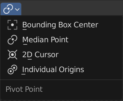
Figure 3: Pivot Point options
The Pivot Point is primarily used in operations such as Rotate and Scale. It defines the point around which the strip image will be rotated or scaled. Using this selector in the header of the Preview, you can change the location of the pivot point.
The Pivot Point is also extensively used in the 3D Viewport; see Editors > 3D Viewport.
- Bounding Box center
The bounding box is a rectangular box that is wrapped as tightly as possible around the selection.
- Median Point
The Median Point is the points that is closest to all the origins of the selected strips. You can think of it as the midpoint of the area that is covered with the selected strips.
- 2D cursor
Sometimes you want to rotate a strip around a specific point in the Preview. Therefore, you can set the 2D Cursor (with the Toolbar) and change the Pivot Point accordingly.
- Individual origins
If multiple strips are selected, you may want to rotate or scale these strips around there own origins instead of for example the Median Point of all selected strips. For example, if you have three portrait strip^s of faces, you probably want each face to be rotated around its individual origin.
1.2.1.3. Display Mode
With the Display Mode button, you can choose between a (default) Image Preview or a Luma Waveform, a Chroma Vectorscope or a Histogram view of the rendered image at the current frame.
- Image Preview
The Image Preview mode shows you what the resulting video will look like when rendered. This is the default working mode.
- Luma Waveform
The Luma Waveform is the graphical representation of the luminosity or brightness of an image or video. For more detailed information about how to use this tool, see section on Color Grading. The examples below are very stylized to explain the basic principles and are not representative for real-world images.

Figure 4: Luma Waveform and Image preview
Figure 4 shows two Preview windows: the left one with Display Mode Luma Waveform, the right one with the default display Mode Image Preview. The image is composed of 4 columns with several areas of grey-scale. The last column also contains the white text “50%”.
The X-axis of the Luma Waveform represents the X-axis of the image. If the image is 400 pixels wide, so is the Luma Waveform. Although you cannot recognize individual shapes of the image (e.g. faces, …) in the Luma Waveform, the 4 columns are discernible in this example because they vary widely in luminosity. The Y-axis of the Luma Waveform represents luminosity, ranging from zero (black) at the bottom to 1 (white) at the top. There are a few preset values (the red lines) at 0.1, 0.7 and 0.9.
The first column in the image has a RGB-value (0.3, 0.3, 0.3), which is a 70% grey. This is shown by the small white line at (a). For a given position X at the horizontal axis, all the pixels in the vertical axis have the same luminosity value of 0.3. This is the interpretation of the single, small white line for the first 100 X-pixels in the Luma Waveform.
The second column contains three small white lines at level 0.2 (d), 0.6 (b) and 0.8 (c). For a given position X (ranging from pixel 100 - 199), there are only three luminosity values, corresponding to the three squares in the image.
The third column in the image is a gradient, ranging from black to white. So, for every position X in the range 300-399, there are multiple luminosity values, ranging from black (0) to white (1) and resulting in multiple white lines. , The luminance values for respectively (c), (d) and (e) are 0.8, 0.6 and 0.2. Because the second column contains only those 3 luminance values, the Luma Waveform shows only three small (white) lines at the values 0.8, 0.6 and 0.2.
The fourth column has a background of 50% grey, resulting in a single white line at level 0.5. The “point-cloud” above the 0.5 luminosity is caused by the anti-aliased white text (50%). Some X positions (right in the middle of the column) have multiple luminosity values: 0.5 from the background and several from the white, anti-aliased text. These values are all above 0.5 because the text is white and is merged with the 50% grey background.
With the sample tool you can determine the Luminosity value and other color values of every pixel in the image. Select the Sample tool and LMB-Click on the image will show this info in the status bar. In figure 4, I’ve clicked on area (d). In the status bar, you can read the L-value: 0.2.
Chroma Vectorscope The Chroma Vectorscope is a graphical representation of the Hue and Saturation x Brightness values of an image. The three primary colors (red, green, blue) and the three secondary colors (yellow, cyan, magenta) and the in-betweens are visualized as a hexagon with the aforementioned colors at the vertices. The center of the hexagon (the red dot) has a saturation x Brightness value of zero (because one or both are zero, the Hue equals Black). The values at the border have a Saturation x Brightness value of 1. Every dot within the hexagon represent a pixel or a group of pixels with the same hue and saturation x Brightness value. A very dim or desaturated image for example will appear as group of dots near the center. An image with a very saturated (blue) sky, will show show as a bunch of dots near the blue border.

Figure 4: Display mode Chroma Vectorscope and Image
Figure 4 contains 14 different hue and Saturation x Brighness values. Each of them is represented by a small dot. The number of pixels with that particular value does not matter. For example, the small rectangles (e) and (f) are equally represented by one (small) dot as the larger rectangles (a), …
Because the rectangles (a), (b), (c), and (d) have all the same (blue-ish) Hue, but a different Saturation x Brightness value, they lie at a line pointing to that Hue at the hexagon border.
- Histogram
The histogram is a graph that visualizes the intensity of the Red, Green and Blue component of a image. The X-axis of the histogram ranges from 0 to 1, which are the acceptable intensity values in a display color space. The Y-axis is a quantity measure: how many pixels have this specific Red, Green or Blue intensity.

Figure 5: Display mode Histogram, together with Sequencer and Image preview
In figure 4, the rendered image is made up of three rectangles. * (a) green RGB(0.2, 0.5, 0.4): 1/8 of the image size * (b) purple RGB (0.7, 0.6, 0.9): a quarter of the image size * (c) red RGB (0.8, 0.2, 0.3): half of the image size
So, there are 9 RGB components, but only 8 of them are different (the value 0.2 occurs two times). Because rectangle (c) contains half of all pixels in the image, the histogram bars are about 0.5 high and they are drawn at X-location 0.2, 0.3 and 0.8. Rectangle (b) is half the size of (c), and so are the histogram bars. They are drawn at location 0.6, 0.7 and 0.9. Rectangle (a) has one RGB component value in common with rectangle (c). The Red component of (a) is drawn on top of the Green component (c), which results in a yellow bar at postion 0.2.
Finally, there is the transparent area (1/8 of the image size). This is represented by a black color RGB (0,0,0), resulting in a white bar (red on top of green on top of blue) at location 0.
You can always check the RGB value by selecting the Sample tool (default) and LMB-Click/ In figure 5, you can verify that the RBB value of the red rectangle is indeed (0.8, 0.2, 0.3).
1.2.1.4. Display Channels
You can choose between:
- Color and Alpha
Display preview image with transparency over checkerboard pattern.
- Color
Ignore transparency of preview image (fully transparent areas will be black).
1.2.1.5. Show Gizmo
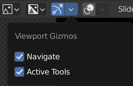
Figure 6: Show Gizmo
With Show Gizmo, you can display the Zoom and Move gizmos of the Preview window (the Hand and Magnifying glass; see Gizmos for more info. You can also enable the display of the Active Tools. These are the gizmos that appear around the selected strips when activating a specific tool (e.g. Move, Scale, Rotate).
This setting is global for all scenes.
1.2.1.6. Show Overlay
Overlays consist of additional information that is displayed on top of the preview region. With the Show Overlay button, you can switch off or on all overlays for the preview region. With the Overlays button (down pointing arrow) you can chose the type of Overlay: Frame Overlay, Safe Areas, Metadata or annotations. The following Overlays are available.
More info about the available options are described in Section Frame Overlay.